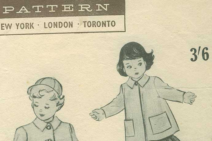
Have you ever made a dress? Or pair of pants? If so, you are familiar with the idea of patterns.
In the clothing world, patterns are carefully measured designs, captured on paper, and used to measure then cut pieces of fabric. The pieces are sewed together to make the dress or shirt or pants. Clothing patterns solve a common problem — people need clothes — in a way that reduces time and error spent creating clothes.
In the software world, website design patterns can be used to describe the screens you might see onscreen and online. They’re called “design patterns” or “page design patterns.”
The content in this article also can be turned into a lesson about website design patterns, as described at the end of this article.
The Website Login Design Pattern
On websites, a common design pattern is the login screen. Here is one well-designed example:
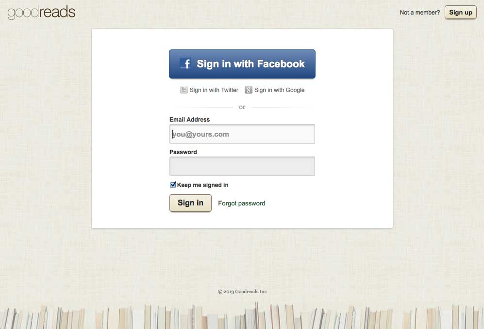
All website login screens share common elements that make up the login design pattern:
- A space to type in your username, often an email address
- A space to type in your password, usually showing stars (*) for each character in your password.
- A “sign in” button to send your username and password data to the software application to be validated.
What happens if your username and password are incorrect? Well, that’s also part of the login design pattern. Typically, you will see the login screen with a message included.
However, there is more to the login design pattern than simply displaying an error message. For example, what if you told the person, “Your username is correct but your password is wrong?” or the opposite, “Your username is wrong, but your password is correct?” That might help you. But it also might help someone trying to break into your account. So the login design pattern includes using error messages that are helpful but not useful to people who try to misuse the login screen.
The login pattern also can include some or all these elements:
- The ability to login with Facebook, Google, Twitter, or other service.
- The ability to sign up if the visitor somehow arrives on the login page by mistake.
- A heading to tell people what page they are on.
- Instructions on how to login.
- A checkbox to save all or part of the login information. For example, you might save the username part so, when you return tomorrow or later this week, you don’t have to type your username, only your password. In other cases, clicking the checkbox automatically logs you into the application when you return.
- A Forgot Password link in case the visitor has forgotten their password. The ability to change a password is not available until you log in successfully and, at that time, you see either a Change Password link or your account page lets you change passwords.
Of course, there are other design patterns you have seen online and in software applications. Here are a few you might recognize, with some quick notes about what is included in each pattern:
The Website Search Design Pattern
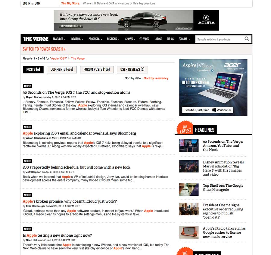
Search pages usually include the original search page and a search box somewhere in the navigation links (often top right of the computer screen), as well as a search results page. The search results page often includes a search box, in this case, hidden behind the orange Switch to Power Search link near the top of the page. Some designers include the search terms used in the search box on the results page, to help people remember what terms they used. This site also groups results by type of content, for example, posts, comments, forum posts, and user reviews.
This screen is a good example of the most common search results design pattern. But the fact the visitor has to find then click on the Switch to Power Search link suggests this page design might be improved. For example, the search box might be displayed outside of the Power Search area.
My guess is the designer of this page had a problem: the search box could be put in both places, directly above the search results and in the Switch to Power Search area, but clicking the Switch to Power Search link would then display both search boxes. That might confuse people: would both search boxes work? People who design pages have to solve these problems all the time. And perfect solutions are not easy to find.
The Website Detail Page Design Pattern
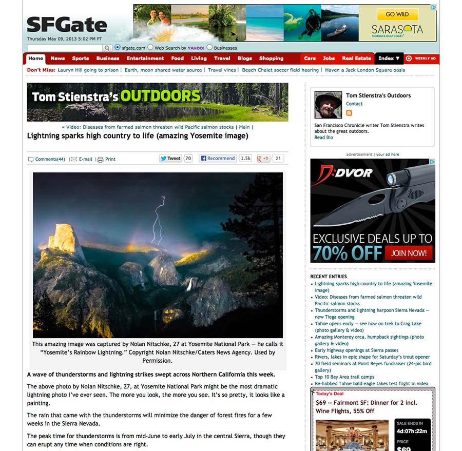
Website detail pages are fascinating because they are very simple yet complex. All detail pages include the page title and content. But many also include the publication date, author name (sometimes linked to a page with a list of all stories by that author), category or topics assigned to the content (also often linked to pages with lists of stories also tagged with those categories), and a set of linked tools, for example, to print the page, email the page, or share the page on Facebook or other social media outlet. All of these elements are found in the example above, from the San Francisco Chronicle website. In addition, if you scroll down the detail page, you often find comments, links to related stories, and other information to keep readers engaged.
The List Page Design Pattern
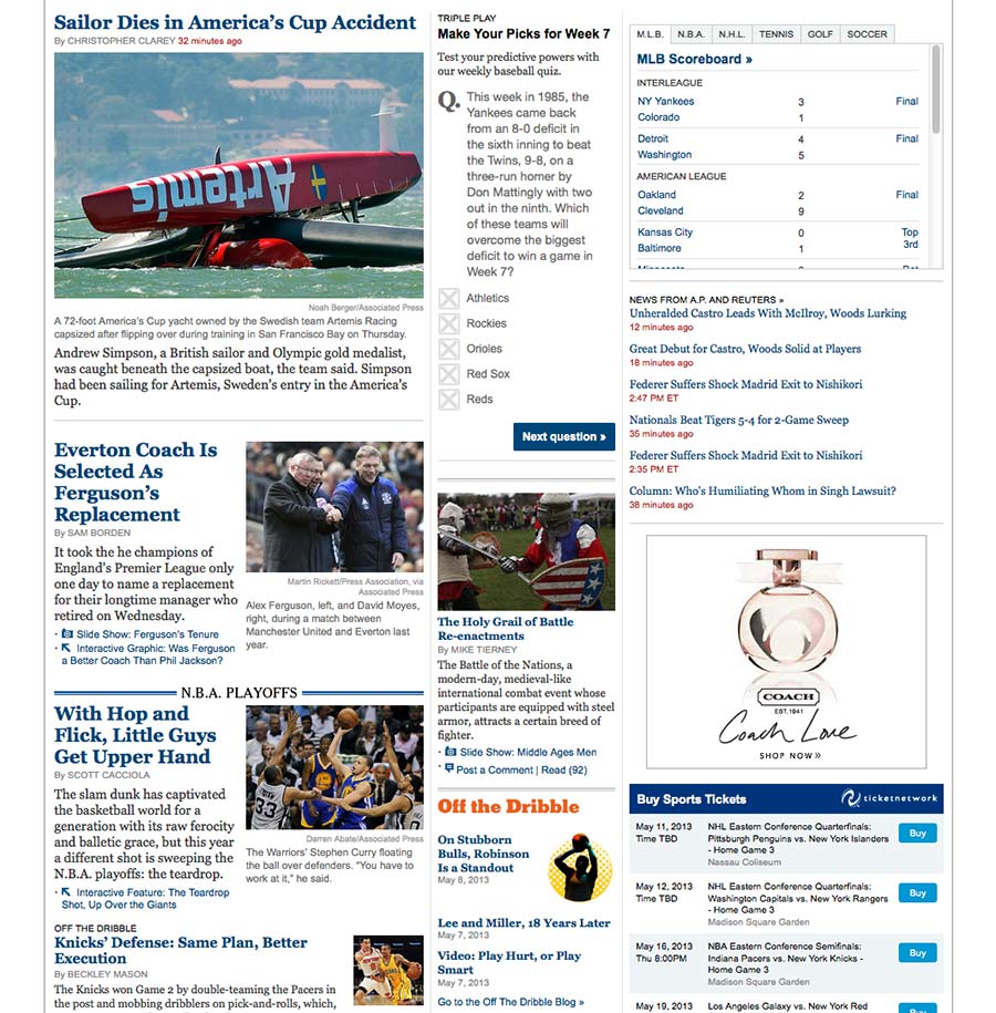
List pages often are fairly simple no matter how busy or complicated the layout, as in this case. They list a bunch of stories. Each story has these elements:
- A headline or story title that, when clicked, takes you to the detail page for the story.
- An excerpt or blurb, often the first 30-50 words in the story. Sometimes this is a short description. Other times, the excerpt ends abruptly.
- Meta data, for example, publication date and categories or topics assigned to the story.
List pages also can add a small image, sometimes called a thumbnail because it’s about the size of your thumb. These small images both add visual interest to list pages and potentially can help readers who remember an image associated with a story but not the headline.
As in this case, the New York Times home page for sports, lists of stories can be grouped by type, for example, top stories, the NBA playoffs, AP newswire stories, even headlines for scores. Everything is some form of list.
The Account or Profile Page Design Pattern
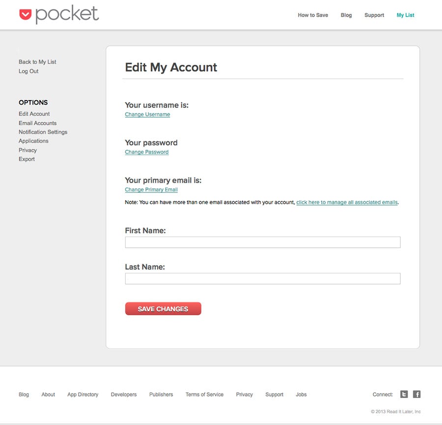
If you have signed up for any website online, you are familiar with account pages. The design pattern for account pages can be very long or short. It depends on what the website needs. But the design pattern always includes these elements:
- A page title to tell you what the page does, store your account information.
- A form with key data about you, for example, your name, address, username, and password. Often these form elements allow you to edit and make changes directly to the form.
- A button to submit any changes to your account information.
The Website Edit Page Design Pattern
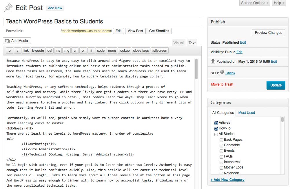
While less common than the other design patterns above, the Edit Page design pattern is interesting because it is like the Detail Page pattern except all parts of that design are in a form. For example, there is a form element to edit the page title, the page URL, the content, and categories assigned to the story. Often you can change the publication date, as well.
A Bonus Design Pattern Problem: News Site Headers
For interface designers, people who design software screens and web pages, the top of a news website is a wonderfully complicated problem to solve. The top header area can have some or all of these elements, and each must fit with the others as part of the design pattern:
- The logo for the website
- Links for visitors to login
- A search box
- An ad, usually a rectangular shaped leaderboard of a fixed large size
- An email newsletter sign up box
- Links organized by topics
- Links organized by content type, for example, articles, news, videos, and job listings
- Links to business areas of the site, for example, how to advertise, how to contact people
- The website tagline, to help new visitors orient themselves about the site content and purpose
- Buttons with links to social media sites
- Links to the daily or weekly ad circulars included with the print newspaper
- Local weather information
Oh, and all this has to fit in the top third of the average computer screen, about 200 pixels high if you’re counting. The width of this header area also is tight, about 1,000 pixels wide. The leaderboard ad type, for example, is 728 pixels wide, leaving roughly 272 pixels for the width of a website logo if the designer decides to put the logo and the leaderboard ad side by side within a 1,000 pixel wide space. If you don’t know, the average desktop computer screen is measured at 1024 pixels across and 768 pixels high.
The design issues become more clear when you look at live website examples.
BBC
Let’s begin with the header area at the top of the BBC website because it has a simple layout design:

This simple header area has these elements:
- The BBC logo
- Links to key topic areas
- A search box
- A rectangular leaderboard ad
Note the use of horizontal and vertical lines to help draw your eye to the logo and top links. This is a clean, simple use of the news site header design pattern.
Environmental Leader
Years ago, I helped redesign an earlier version of this site. It’s where I first discovered the joys of the news site header design pattern. We looked at a dozen news sites, to see what elements they included and how they laid these bits out. Here is the current Environmental Leader header design:

This header design includes most of the possible elements listed above. However, the elements are laid out in a tight horizontal and vertical grid. This makes it easy to scan. Links also are grouped to make scanning them much easier than if links were mixed together or laid directly one set of links on top of another.
The only element missing is local weather and a link to ad circulars, neither of which are relevant for this site. Note the small thumbnail ad at the bottom left of the header: a second ad opportunity that is noticeable but does not get in the way of visitors using the header area to find content they want. In fact, advertisers prefer sites where their ads stand out instead of become lost in content. That makes header design an even more complicated problem to solve.
Le Monde
This French news site also includes many of the elements of the header design pattern. Instead of a rectangular leaderboard ad, however, the site logo is prominent.

You do not need to know French to quickly scan all the different options in this design.
The Miami Herald
Finally, one of the more interesting uses of the news site header design pattern can be found on The Miami Herald website, as shown below. In addition to the elements listed above, they also include live scores for the Miami Heat playoff basketball game, as well as the local weather.
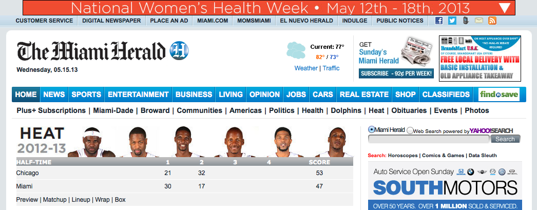
Also note the bright red top block for National Women’s Health Week. While this is an extremely busy header design, it also uses white space and a tight horizontal grid to make it easy for visitors to scan links to find content they want.
Lesson Plan Ideas
Design patterns for website and online applications are excellent ways to get students to recognize and discuss what they see online and how they use these tools. For example, students might be asked to identify and discuss website pages the teacher calls up for the class. Or students might be asked to find and print out examples of different design patterns. Students also might cut and paste a design pattern, or hand draw a pattern, to solve problems shown above with the search page and news header patterns.
The news header design pattern also lends itself to research and discussion. It’s easy to find a dozen different news sites online and compare their elements to a list of possible elements to be included at the top of news websites.
In addition, discussion should include ideas about how to simplify a page design, based on its pattern, as well as ideas how to improve a page design. The search results page design pattern shown above, for example, works but it also could be improved to help visitors more easily navigate the page.
Once you recognize these common website design patterns, it becomes much easier to find new patterns as you work online. Plus, if you design software, it becomes easier to figure out all the screens you need to design. Instead of having 50 categories and thinking you have to design 50 different pages, one page for each category, you only have to design one list page pattern to use for all 50 pages that will display your stories as a list.
And, if you forget about search when you design your application, knowing there is a website Search page design pattern can help remind you to think about how you want to design the search result pages and search box.
These are the most common website design patterns for software interfaces. These patterns also can be combined, for example, the results part of a search page really is a list page design pattern. Sometimes you’ll see a totally different way to do a page design. New patterns can be exciting or frustrating, depending on whether the new design works (or not).
Website design patterns offer proven solutions to common page design problems found online in websites and software. They also can shorten the learning curve for new interfaces.
The links below provide many different design patterns for pages, as well as parts of pages. There also are phone and tablet pattern sites to browse. Small form factor solutions can work well on desktop computer screens. Certainly the tight space of phones and tablets leads to clever solutions to convey complex information efficiently.
Learn More
Wikipedia
http://en.wikipedia.org/wiki/Interaction_design_pattern
Yahoo! Design Pattern Library
http://developer.yahoo.com/ypatterns/about/libraries.html
http://developer.yahoo.com/ypatterns/
FactoryJoe's Flickr Collection
http://www.flickr.com/photos/factoryjoe/collections/72157600001823120/
Erin Young Design Pattern Library List
http://www.erinlynnyoung.com/215/design-patterns-libraries/
Responsive Patterns
http://bradfrost.github.com/this-is-responsive/patterns.html
Elements of Design
http://www.smileycat.com/design_elements/
PatternTap
Cocoanetics iOS Design Patterns List
http://www.cocoanetics.com/2011/11/steal-good-stuff-ios-design-pattern-collections/
TappGala Mobile Interface Design Patterns
Android Patterns
http://www.androidpatterns.com/
pttrns iOS Mobile Design Patterns
Mobile Patterns
http://www.mobile-patterns.com/
Patterns of Design
http://www.patternsofdesign.co.uk/
40 Helpful Resources on User Interface Design Patterns (Smashing Magazine)
http://www.smashingmagazine.com/2009/06/15/40-helpful-resources-on-user-interface-design-patterns/
Fluid Project
http://wiki.fluidproject.org/display/fluid/Design+Patterns
News Websites
http://www.bbc.co.uk
http://www.environmentalleader.com
http://www.lemonde.fr
http://www.miamiherald.com/
http://www.suntimes.com/
http://www.chicagotribune.com/
http://www.seattletimes.com/
http://www.sfgate.com/
Photo courtesy of ionascloset on Flickr.

