
Computer hardware and software let us see history in ways we could not imagine until recently. These resources might be great to share with anyone curious how the world works and has worked in the past. They are a good way to introduce students and kids to global issues related to technology, and start a conversation. Links are collected at the bottom of this article.
Three Hundred Years of the Atlantic Slave Trade in Two Minutes
One animation in two minutes shows 315 years, 20,528 voyages, and millions of lives brutally changed forever, from 1545 to 1860. Every fast moving blip from Africa represents dozens if not hundreds of men, women, and children taken from their homes in Africa, most never to return to family and friends. The article tells the story in more detail and is part of Slate Magazine’s online course about slavery.
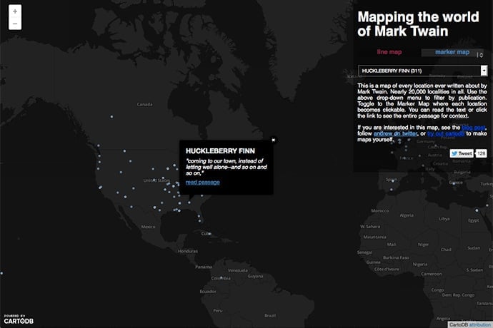
Mapping the World of Mark Twain
How are maps stories? And how are stories maps? Andrew Hill, a former biologist, programmer, and map enthusiast, spent a weekend extracting all the locations mentioned in works by Mark Twain. There are 20,000 locations total. Then he created an interactive map. You can view locations by book or all of Twain’s books, as well as with lines or single dots. The map results present a totally different view of the work of Mark Twain.
The World Online
The Oxford Internet Institute has used World Bank data to create a worldwide map of internet use by country. Their map shows the total number of internet users in a country, expressed in size, and the percentage of people in a country who have internet access, expressed in color shade. The Institute has a number of other interesting research projects worth poking around. For example, they have a map to track the global disparity in wages for people who use the internet for work, as well as how many people work online.
Crisis Trends
This data repository shares information summarized from cases the Crisis Text Line has handled with teenagers over several years, for example, words used by people who suffer from anxiety, bullying, and friend issues. Or the time of day people ask about eating disorders. If you don’t know, the Crisis Text Line is a free counseling service for US teenagers that uses texting to connect people and predictive software to help counselors find the best resources to help quickly. Because they help teenagers often in crisis, and people are human, some of the words and topics you might read on this site may shock, concern, or sadden you.
The Biggest US Cities by Decade 1790 to 2010
This animated GIF shows the population change of the United States every decade from 1790 to 2010. In 1790, nine of the largest cities were in the Northeast and Charleston, South Carolina was the tenth city. By 2010, population expanded across the country to include not only Los Angeles but also San Jose and Phoenix. Keir Clarke adapted the GIF to use Google Maps and show the mean population size as it moves over time from the Northeast to the Midwest. Clarke’s Google Maps Mania blog includes lots of other data driven maps to explore.
The Internet Traffic Report
This website displays the flow of data on the internet around the world. Data is updated every five minutes and you can drill down to continents. This project has been online since 1998. The data differs based on day of the week and time zones, with weekends more quiet with better data flow than week days.
Learn More
The Atlantic Slave Trade in Two Minutes
Mapping the Work of Mark Twain
The initial article also includes links to CartoDB tutorials if you want to explore your own data sets.
http://andrewxhill.com/maps/writers/twain/index.html
http://andrewxhill.com/blog/2014/01/26/Mapping-the-world-of-Mark-Twain/
https://team.cartodb.com/u/andrew/me
http://docs.cartodb.com/tutorials.html
https://cartodb.com
http://www.gutenberg.org/ebooks/search/?query=mark+twain&go=Go
The World Online
http://geonet.oii.ox.ac.uk/blog/the-world-online/
http://cii.oii.ox.ac.uk/uneven-geographies-of-digital-wages/
http://www.oii.ox.ac.uk/
Crisis Trends (US)
http://www.crisistextline.org/trends/
The Internet Map
The Disease Map
16 Great Data Visualization Tools to Teach You How to Visualize Data
If you have data, from spreadsheets to music, this article links to often free tools you can use to create your own data maps.
http://www.outbrain.com/blog/2014/07/16-great-data-visualization-tools-to-teach-you-how-to-visualize-data.html
The Biggest US Cities by Decade 1790 to 2010
http://homepage.ntlworld.com/keir.clarke/leaflet/cities.htm
http://imgur.com/tWE7i
http://googlemapsmania.blogspot.com/2015/08/the-biggest-us-cities-by-decade.html
The Internet Traffic Report
http://www.internettrafficreport.com/
https://web.archive.org/web/*/http://www.internettrafficreport.com