
The history of computer interfaces is still evolving. The first computer interfaces were punch cards, large wheels to hold tape, and big buttons and switches. Popular use of the internet led to the use of icons on websites which recently has led to the use of intelligent updated tiles in the Windows 8 operating system.
At each point in time, designers had to create a physical interface to allow users to work with a mainframe, desktop computer, laptop, tablet, phone, or other electronic device. The interfaces had to be durable and easy for users to understand and remember.
Here's what I think of when I think about old computer systems, this one an IBM 360 Model 91 (sold from 1965 to 1978) with a control panel with buttons and switches:

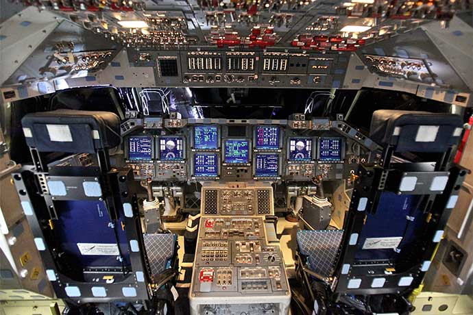
I wonder the reason buttons were used, even today in planes, submarines, space capsules, and power plants. Perhaps physical buttons are more durable than a screen that might break? And there is a lot to be said for the pleasure of pressing a big button. However, the need to memorize the location and purpose of so many buttons should lead to mistakes.
Also the buttons, switches, and gauges on early airplanes then early computers look a bit like those used on factory machinery built in the 1800s. Designers started with the every day interfaces people were used to, whether a steam engine or a jet plane.
Software displayed on a flat computer screen created a new territory for designers to create ways for people to interact with computers. As we'll see, at first designers simply copied what worked in the real world: big buttons became icons.

What Makes Buttons and Tiles Useful
Buttons, icons, and tiles are examples of affordances. The easiest way to define an affordance is to ask a question: how do you know a door is a door?
Usually, a door has a handle, a knob, or flat metal (or plastic) panel about chest height. These devices, or affordances, visually tell you a door is in front of you, as well as how to open the door. If the handle is on the far right, for example, you know the door swings open to your left side. Or possibly pushes forward and swings left if the affordance is a panel.

Now imagine a door with no gap between it and the wall. The door and the wall also are the same color and material. This door has no handles to cue you to the presence of the door. Would you be able to use the door? Would you even notice the door?
Designers use buttons, icons, and now active tiles to let people know they can interact with each of these elements. Buttons also might have words and use color to reveal their purpose: a red button with the word "Stop" probably stops the computer.
If the red button with the words Stop on it, instead, started the computer, people would be confused. Westerners, at least, associate the color red with stop and danger. And the English word "stop" means halt, go no further.
Or imagine a door handle bolted on to the roof of a car. We might laugh, thinking the car is a piece of luggage. But the humor stems from our association of door handles with doors.
Icons Evolved From Buttons
Icons on web pages provide designers with an irresistable opportunity to use images to cue people about what happens when they click on an icon.
However, applications that do many different things can quickly overwhelm people with too many icons of the same size. I call this effect, "iconitis." It used to be very common in the early days of the internet. Here's a typical web server control panel application:

Too many icons in a tight grid paralyzes people. They don't know where to look. Every icon is the same shape and size, perhaps even the same color. You have to stop to look carefully at every button in the grid to identify its purpose. The only way out is to use the interface long enough to memorize the location of icons commonly used.
Today iconitis is limited, oddly enough, to the Android and iPhone operating systems where icons are in a tightly defined grid with each icon the same size. Even the brand new iOS7 interface still relies on icons of the same size organized into tight 4×5 grids.

Realism versus Flat Abstraction
Another dynamic in the evolution from buttons to icons to tiles is realism versus abstraction. Realism, also called skeumorphism, uses non-digital visual elements people are comfortable with, for example, a yellow note paper background with ruled lines in a note taking application. Or an icon with glossy highlights and drop shadows, as if there was a strong light above and to the top left of the icon.
The risk with realism is the effects will overwhelm the content of a button or application. Realism works best when it is used discretely, for example, a quiet fabric pattern background when you look directly at the background that blurs and disappears when you shift your focus to a software application. Here is the grey fabric background from Apple’s OSX operating system:

Abstraction, also called flat design, uses the essential qualities of digital interfaces where visuals have a flat shape, colors are simplified, and there are no shadows or highlights. With abstraction, the focus is on the purpose of the button, usually conveyed through text and sometimes by location. For example, a button at the bottom of a form probably submits data.
In the example below, notice how white and red block areas feature content while the black blocks offer navigation. And across the top, notice text replaces icons for the Buy Now link (which often uses a shopping cart icon):

The risk with abstraction is an interface where all form fields, buttons, and text are of equal color and visual value. The user might find it difficult to know what to look at on the computer screen. While realism is disparaged by designers who push abstraction, realism often uses otherwise pointless effects to help guide people to what they need to do or read. In the example of flat design above, the white content sample, red, and black color blocks create a visual hierarchy to make it easy to scan the web page and identify what to read, and in what order.
Which is better, realism or abstraction? It depends on the designer's taste, what people who use the software expect, and current trends. In some ways, the choice does not matter. Design is not about realism or abstraction. Design is about leading the eye to help people find and prioritize visual information. Realism and abstraction are merely tools, two of many, to communicate the purpose of a software application, how the application works, and/or content.
Live Tiles Are One Evolutionary Direction
Buttons and icons have (maybe) reached the end of their usefulness. They will not disappear. However, buttons and icons cannot solve some newer problems, for example, helping people sort data and expose data in useful ways.
The updateable live tiles in the Windows 8 phone operating system show one possible evolution beyond buttons and icons. Instead of rigidly sized and carefully controlled inert icon shapes, live tiles display data you otherwise have to click through to see. A tile with local temperature and forecast that updates is much more immediately useful than a square icon. It also allows each person to identify what data sources are important to them and make that data available on their phone or computer screen, saving themselves a click or two.

While Windows 8 is a work in progress, with slow adoption rates in the corporate world and on cellphones, its use of live tiles should lead other designers to try them.
Progress may take awhile, however. The phone prototype with the Ubuntu operating system, for example, uses tiles but as over-sized buttons, not as a way to pull up useful data and reduce the number of taps people make to reach the data.

Perhaps the best use of active tiles would be an operating system where people can create tiles from their favorite applications, set the width and location of their tiles, and specify what data they want to appear on their tiles. Instead of hunting through icons of the same size, people would turn on their phones, tablets, and computers to see instantly the data they want, whether it is the score for their favorite team, the weather, or their to do list for the day.
Active tiles also might work for software applications where people play different roles, for example, publishing software with writers, photographers, marketers, editors, publishers, and site administrators. Each group would have the ability to arrange their most frequently used data and functionality into tiles of appropriate sizes. A marketer, for example, might choose a full-width tile with six website activity data points to appear at the top of their start page with two half-width tiles underneath, one with links to all their content and another with links to content waiting for their approval.
Learn More
Apple iOS7
http://www.apple.com/ios/ios7/design/
Flat Design vs Skeumorphism
http://www.wired.com/opinion/2013/06/why-jony-ives-and-apple-ios7-are-holding-back-the-future-of-design/
http://www.wired.co.uk/news/archive/2013-06/12/ios-evolution
http://arstechnica.com/gadgets/2013/06/cupertinos-photocopiers-what-ios-7-borrowed-from-android/
http://bits.blogs.nytimes.com/2013/04/23/the-flattening-of-design/
http://www.nytimes.com/2012/01/08/technology/microsoft-defying-image-has-a-design-gem-in-windows-phone.html?pagewanted=all
http://www.nytimes.com/2012/11/01/technology/apple-shake-up-could-mean-end-to-real-world-images-in-software.html?_r=0&pagewanted=all
20 Examples of Flat Elements in Web Design
http://bashooka.com/inspiration/examples-of-flat-elements-in-web-design/
40 Years of Icons: The Evolution of the Modern Computer Interface
History of the Graphical User Interface (GUI)
https://en.wikipedia.org/wiki/History_of_the_graphical_user_interface