


Comic Sans is one of the most frequently used fonts in the world. The Vatican even used Comic Sans in a serious document paying tribute to the last Pope. For a much-used font, however, it is widely hated and ridiculed. The history of Comic Sans, however, is a great way to be introduced to typography and fonts.
What’s a font, you might ask? It’s the mostly unique shapes of letters, numbers, punctuation, and symbols gathered into a single collection. The shapes of a letter or number are called letterforms. Only a few people notice the differences between a letterform in one font and another. You might think the lower case letter a or a question mark can only appear in one form. But you’d be wrong.
Do you recognize this font?
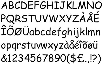
It’s some of the Comic Sans letterforms. While the recognizable shapes of a font become obvious when you look at a specimen like this, when you read online or in print, most people don’t see any real difference between one font and another. However, most people make judgments based on the choice of font.
Imagine you have two stands selling sushi. One stand has its sign in tall thick block letters of a cowboy Western font. The other sushi stand has its sign in a font with letters shaped and curved like Japanese brush strokes. Which sushi stand would you trust as authentic? Probably the stand with the Japanese-looking font. While this is an extreme example, we encounter fonts every day, online and offline, and we make decisions based on how we respond to these fonts.
Which is what makes the Vatican tribute to the last pope’s so interesting. Comic Sans is a friendly light-hearted font. It was designed for cartoon speech balloons. Tributes and resignation letters are serious and thoughtful. Perhaps the font is so common no one notices the clash between fun font and serious message.
Or maybe the last Pope was a barrel of fun and the people who worked for him wanted to reflect that fact.
The History of Comic Sans
The Comic Sans font did not begin life to be hated and laughed at. Or called “the Crocs of the design world” after the brightly colored plastic shoes found everywhere on earth.
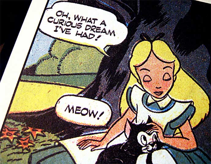
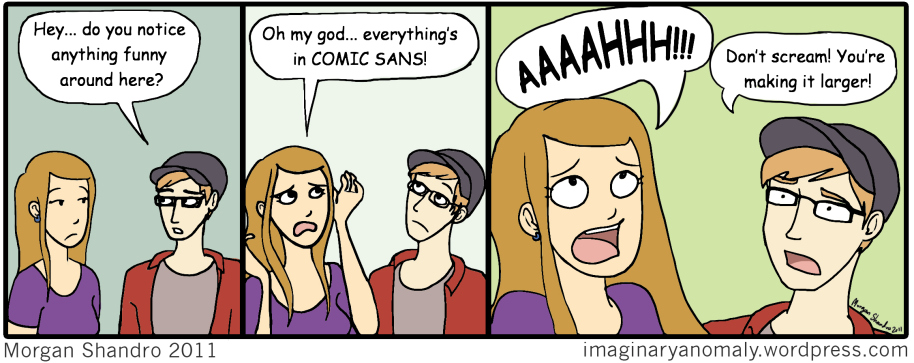
Vincent Cannare, who worked at Microsoft with the title “typographic engineer,” created the font in 1995 to be used in speech balloons in Microsoft’s Movie Maker software. Lots of designers debate whether the font is the best available for that purpose. A computer font for speech balloons often tries to look like handwritten letters. Cartoons use speech balloons to show characters talking, as in this cartoon which uses Comic Sans as both a font and a target of humor:
According to Connare, in an interview with Dekeen magazine and on his own website, he did not start by creating the font. He was in a meeting at Microsoft and was asked what he thought about a project called Microsoft Bob which had speech balloons which told people how to do things in Windows, as a way to help people. Bob’s speech balloons used Times New Roman. Connare thought it was an inappropriate use of Times New Roman, a font that feels official and formal not friendly. So he went back to his office, looked at a few comic books, and drew on his computer screen a few sample letterforms to show the Microsoft Bob team how a hand lettered font might be more suitable.
From this small demonstration project, he was asked to create the Comic Sans font. The Microsoft Bob project was too far along to include the new font but the font was selected for Microsoft’s Movie Maker software.
Once in the Movie Maker software, however, Comic Sans made the jump to Windows where it became a default font anyone could use in any situation. It’s also available with web browsers. Add in the desktop publishing revolution, which happened in the 1990s, and Comic Sans made the perfect friendly font for normal non-technical people to use.
What is it about Comic Sans People Hate?
One big reason: people use Comic Sans everywhere without much thought or care.
However, this leads to a great question: how do designers know people use the font without much care?
It’s possible people look through all the Windows fonts and find other fonts cold and unfriendly. They pick Comic Sans because it is non-threatening and their presentation, sign, or document also is meant to be non-threatening, less formal, and not cold. Designers might argue people should pick more carefully based on where the font is to be used. And they’d always like people to have a better selection of fonts. However, most people know very little about fonts beyond an often hidden like or dislike.
A more interesting reason designers hate Comic Sans has to do with their critique of the font itself. They argue the first few letters — a b c d e — appear to be based on a circle without much variation (scroll up to the Comic Sans letterforms and see if you agree). Comic Sans also can’t be manipulated as easily as other fonts, in a process called kerning, which is critical when you try and fit copy to a defined horizontal or vertical space in a print or online document. Unlike most professional fonts, however, Comic Sans letterforms often force designers to adapt the print or online space to the font.
Designers think the designer of the Comic Sans letterforms got lazy and should have paid more attention and added more value. The font was created in 1995, however, and tools to create fonts were primitive by today’s standards. Maybe shaping a letter form to a circle in 1995 was not necessarily lazy. Also remember the font was created for a software application, not printing on paper.
In addition to complaints about shape and kerning, designers point to other casual fonts used in speech balloons which are designed more carefully with more beautiful letter forms.
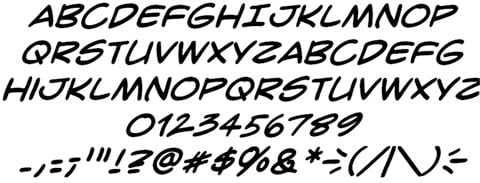
Here is a sample of the Crime Fighter BB font, for example:
And here is a sample of the Felt Tip font:
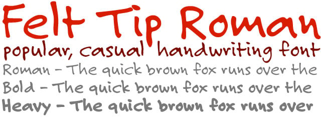
And for comparison here are some of the Comic Sans letterforms:
Pick a letter or character in one of these three samples and look up the letterform in the other two examples. Differences are subtle but distinctive. Each font has a unique character.
The reasons designers dislike or hate Comic Sans boil down to two or three key issues:
Over-exposure — the Comic Sans font shows up everywhere, it seems, from flyers advertising lost kittens to papal tributes.
Appropriateness — what if the Declaration of Independence and Magna Carta had used Comic Sans? Would people laugh or take these documents seriously?
Interesting Comic Sans Facts
The designer of Comic Sans, Vince Connare, does not identify himself as a type designer. He calls himself a type technician. Before Microsoft, he worked on the Ikarus, Intellifont and TrueType teams for Agfa/Compugraphic and Apple on early efforts to convert print fonts to display well on computer screens. These early digital projects were complicated and difficult to achieve.
Comic Sans is not a free font. It’s available because Apple and other companies pay for you to use the font in your web browser or operating system.
If you Google “worlds most hated font,” Comic Sans appears at least once in the top 10 search results. Same for Yahoo!, Bing, and Duck Duck Go search engines.
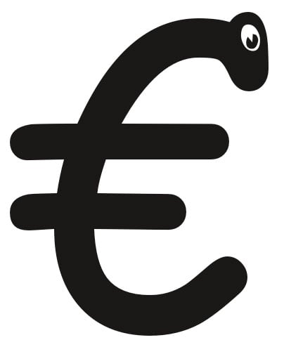
One Comic Sans letterform, the Euro symbol, started life with an eye. According to Vince Connare, the eye had to be removed due to legal threats from the European Union.
Learn More
Comic Sans
http://en.wikipedia.org/wiki/Comic_Sans
Vince Connare
http://www.connare.com/
https://twitter.com/VincentConnare
Why Comic Sans
Connare’s history of creating Comic Sans
http://www.connare.com/whycomic.htm
Fonts Included in Microsoft Products
http://www.microsoft.com/typography/fonts/
Dezeen Interview with Vincent Connare
http://www.dezeen.com/2014/11/27/vincent-connare-typography-interview-comic-sans-ms/
Higgs Boson Announcement Made in Comic Sans
http://www.huffingtonpost.co.uk/2012/07/04/higgs-boson-discovery-comic-sans_n_1648494.html
Pope Benedictus XVI Tribute
His resignation letter is on page 61 of this document, published in Comic Sans.
http://www.vatican.va/bxvi/omaggio/index_en.html
Why You Hate Comic Sans
Excellent and detailed technical description of the problems with Comic Sans, with an emphasis on lost kitten posters.
http://kadavy.net/blog/posts/why-you-hate-comic-sans/
What is wrong with Comic Sans?
http://graphicdesign.stackexchange.com/questions/38226/what-is-wrong-with-comic-sans
What’s So Wrong with Comic Sans?
http://www.bbc.com/news/magazine-11582548
Can Anything Save Comic Sans, the World’s Most Hated Font?
http://www.huffingtonpost.com/gerhard-bachfischer/comic-sans-font_b_5188026.html
Not My Type: Why the Web Hates Comic Sans
http://mashable.com/2012/10/03/comic-sans-history/
New Study Explains Why Comic Sans Font So Hilarious
From The Onion, with cheap shots at WingDings and Papyrus tossed in.
http://www.theonion.com/video/new-study-explains-why-comic-sans-font-so-hilariou,21202/
Comic Sans Cartoon
https://imaginaryanomaly.wordpress.com/2012/01/10/comic-sans/
Comic Sans Criminal
http://www.comicsanscriminal.com/
Ban Comic Sans Website
Top 10 Most Notoriously Hated Fonts
http://www.topdesignmag.com/top-10-most-notoriously-hated-fonts/
There is Nothing Wrong with Comic Sans
The one site I found which supported the font.
https://eamann.com/tech/theres-nothing-wrong-with-comic-sans/
Comic Sans
Try out the font with your own words and phrases at My Fonts.
https://www.myfonts.com/fonts/microsoft/comic-sans/
Letterform (Wikipedia)
http://en.wikipedia.org/wiki/Letterform
Typography (Wikipedia)
http://en.wikipedia.org/wiki/Typography
Felt Tip Roman Font
https://www.myfonts.com/fonts/marksimonson/felt-tip-roman/
https://typekit.com/fonts/felt-tip-roman
CrimeFighter BB Font
A great source for informal handwritten comic book fonts better designed than Comic Sans.
http://www.blambot.com/